
 The room was originally a red and peachy color, and it wasn't working for me. So, I did some research and found a color I really liked: Benjamin Moore's Smoke.
 I wanted a color that was calming, and not too bright. I wanted something that had a bit of gray in it. This color seemed to fit perfectly. Only problem - when I began painting - was that it seemed too baby-blue-ish. I didn't want that for the office, so I went back to Ace and asked them to help me change the color.
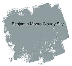 This color - Cloudy Sky - was very similar to Smoke, only a bit darker. We weren't able to match it exactly because of the way the machines work, but we got close. This color of my paint is a little lighter than this sample, but more gray than the first one and looks less baby-ish in the room. And made specially for me thanks to the manager at Ace!
In this picture you can see the ugly red-peach combination that was previously going on. You can also see the light blue that I tried first. Granted, it probably wouldn't have been as bad as I think, but the darker color is just so much more what I'm going for.

Since Hubby has the camera and is now on the other side of the world, I do not have picture of the finished product. Those will come in time..... But, how's the color?
1 comment:
I likey :o)
Post a Comment